Chart with Static Series
This document describes how to create a report with a Chart control bound to data, so that a specific series has its own data source and other settings. To simplify the example, both series obtain their data from the same data source. However, different data sources can be used for different series, if necessary.
This example describes how to construct a chart of products and their prices for a chosen category.
To adjust a Chart by manually creating its series, do the following.
-
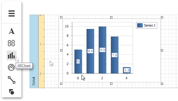
Drop the Chart control from the Toolbox onto the report's Detail band.
-
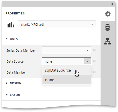
To bind the Chart to a data source, in the Properties Panel, Data category and specify the Data Source property.
 Note
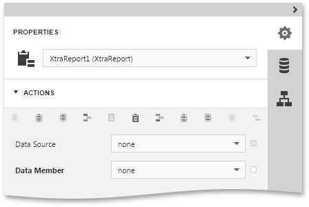
NoteSince you have placed the Chart in the Detail band, the report's Data Source property should be set to None.
-
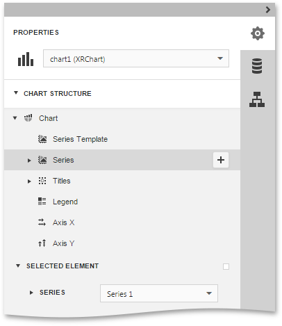
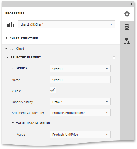
So once again, select the Chart control, expand the Chart Structure category and then expand the Chart node. To set properties of a chart element (for example, series), select the required element in the Chart node and expand the properties list by clicking the Selected Element node.
-
In the Selected Element node, choose the required series, assign data fields to the Argument Data Member and Value Data Member properties, which determine the coordinates for series points.
-
Then, back in the Chart node, select the Series subnode and click Add series to create a new series. In the invoked drop-down list, select the Point view type.
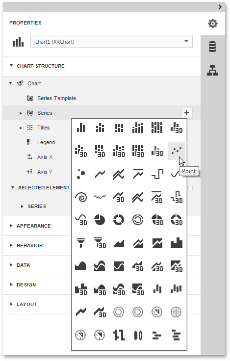
Specify other properties of the created series so that it is similar to the Series1.
-
Finally, to improve your Chart's appearance, you can make the following adjustments.
- Remove the Chart's legend, as it shows the same data for both series. To do this, in the Properties Panel, unable the Show In Legend property for each series.
- The point labels for Series1 are unnecessary, so set the Labels Visibility property to False.
- Rotate the X-axis labels for better readability. To do this, in the Chart node, select the AxisX item, and adjust properties for its labels (via the Label property). For instance, if the Angle property is 20 and the Enable Antialiasing property is set to True,
If required, it is possible to customize many other properties for the Chart, which are not described here.
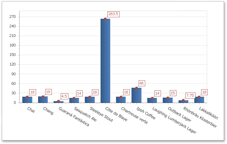
The chart is now ready. Switch your report to the Preview mode and view the result.
Create powerful mobile forms for your business in minutes