Data Presentation Basics
The Dashboard Viewer is used to present dashboards on the web. A wide range of dashboard items are used to display visual or textual information.
|
Dashboard Item |
Image |
Description |
|---|---|---|
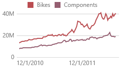
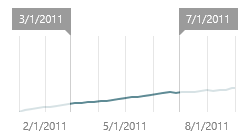
| Chart |
|
Displays data graphically using bars, lines, points, etc. |
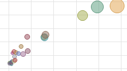
| Scatter Chart |
|
Visualizes relationships between numeric variables. |
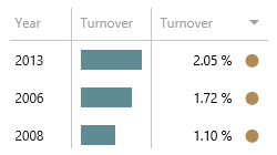
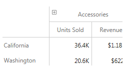
| Grid |
|
Presents data in tabular form. |
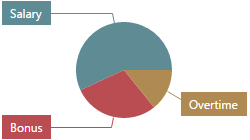
| Pies |
|
Displays a series of pies or donuts that represent the contribution of each value to the total. |
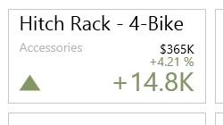
| Cards |
|
Displays a series of cards, each illustrating the difference between two values. |
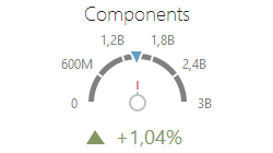
| Gauges |
|
Visualizes data within a series of gauges. |
| Pivot |
|
Displays cross-tabular reports and allows you to analyze multi-dimensional data. |
| Choropleth Map |
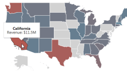
|
Colorizes areas in proportion to the provided values. |
| Geo Point Map |
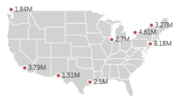
|
Displays callouts on the map using geographical coordinates. |
| Bubble Map |
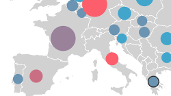
|
Displays bubbles on the map using geographical coordinates. |
| Pie Map |
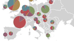
|
Places pies on the map using geographical coordinates. |
| Range Filter |
|
Allows you to apply filtering by dragging selection thumbs along the argument axis. |
| Images |
|
Displays images. |
| Text Box |
|
Displays rich text within a dashboard. |
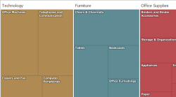
| Treemap |
|
Visualizes data in nested rectangles. |
| Combo Box |
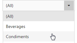
|
Allows you to select a value(s) from the drop-down list. |
| List Box |
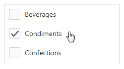
|
Allows you to select a value(s) from the list. |
| Tree View |
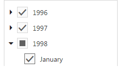
|
Displays values in a hierarchical way and allows you to filter other dashboard items by selecting parent/child values. |
The Dashboard Viewer enables interaction between various dashboard items. These features include Master Filtering and Drill-Down.
To learn more about the dashboard layout, see the Dashboard Layout topic.
Create powerful mobile forms for your business in minutes