Data Presentation Basics
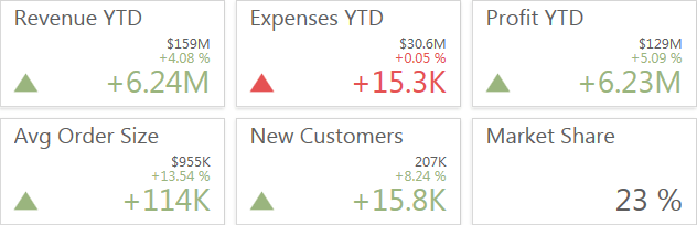
The Card dashboard item displays a series of cards. Each card illustrates the difference between two values. This difference can be expressed as an absolute value, an absolute variation or a percentage variation.
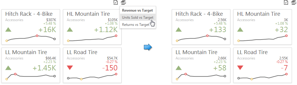
The
Card
dashboard item can illustrate this difference for various sets of values. You can switch between these sets using the
Values
button (the
 icon) in the card's
caption.
icon) in the card's
caption.
Tooltip
A Card dashboard item can display a tooltip for cards containing a sparkline. When the mouse pointer is hovered over the sparkline, the tooltip can display start/end values and minimum/maximum values.

Create powerful mobile forms for your business in minutes